All reproduction rights reserved, copyright Jan Blencowe 2006. NO images on this website may be reproduced in any manner without express written permission from Jan Blencowe.
Showing posts with label pen. Show all posts

Friday, December 14, 2012

Product Review: Stillman and Birn ZETA Paper

To see my paintings visit my website www.janblencowe.com


As many of you are aware Stillman & Birn makes what I think to be the best sketchbooks currently on the market today. The quality and variety of papers, and the variety of formats (size, spiral, hardbound) covers a broad range and offers just the right product for any sketchbook artist.

Stillman & Birn sent paper samples of their newest paper choice, Zeta, to a number of artist to try and review. I have not read any of those yet so that I would have no preconceived notions about the paper going in. But you can read Jamie Williams Grossman's review here, Jeanne Forsyth's review here, and a review from Liz & Borromini here.

Yesterday, I gave the new Zeta paper a whirl. If you're familiar with my sketches you know that I am a mixed media maven! One of my top requirements in a sketchbook is that the paper be able to handle all kinds of media, both wet and dry together in one sketch, or on one page spread.

The Zeta paper is a "cousin" to Stillman & Birn's Epsilon series paper.  Plate smooth, and really lovely to the touch. While the Epsilon is 90lbs, the Zeta is twice that, at a beefy 180 lbs. This for me is a big plus right out of the gate. I just have to have a heavy weight paper to work on. Something substantial so I don't have any worries about the paper buckling, the surface peeling,  getting rough or abraded, or any reservations about scrubbing, lifting or layering.

The Zeta paper, like all Stillman & Birn papers is sized inside and out, which means that wet media like watercolors and ink lay on top of the paper without sinking in too fast and reduces "staining" the paper meaning that you can lift color. Yay! But this is a little different than hot pressed watercolor paper, flat and graded washes may be a bit challenging on the other hand wet media brush strokes will remain, (as you can see especially in the lower left hand background in the sketch above), and that can be an exciting advantage adding, spontaneity, energy and movement to a piece, something I like.

So what exactly did I throw at this paper?? Well, pretty much everything but the kitchen sink......

  • Uniball Vision Pen -black
  • Sharpie Marker-black
  • Daniel Smith Watercolors
  • Winsor & Newton Gouache
  • Plaid Folk Art Gold Acrylic Paint
  • DecoColor Opaque Paint Marker - white
  • Uniball Gold Gel Pen
  • Blue Painters Tape

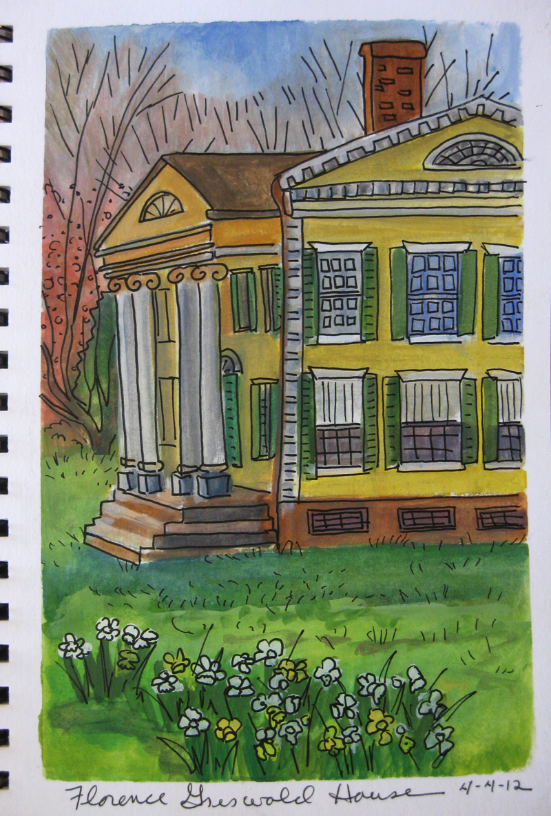
I worked on this sketch for about 1.5 hours. There are a LOT of layers and a lot of wet media used, that's important to know because I watched closely to see if the paper would buckle when wet.  It did, but only slightly, and from it's wettest point when I could see the buckling it dried and flattened to only a slight wave in about 15 min. Today the paper has just a slight curve but if I put it under a book I'm confident that it will flatten out completely. That means that bound in a sketchbook the paper once dry will flatten out beautifully once the book is closed.

Pen on Zeta

I started this sketch using a UniBall Vision Pen, then later on switched to Sharpie and added bling with the gold gel pen. I am happy to report two things that made me very happy...

  • the pen never missed or skipped
  • the ink dried very fast on the surface and there was no smudging
A third quality I noticed is neither a pro or con just something to be aware of is that multiple pen lines close together, or in cross hatch pattern, could get very dark very fast


Paint on Zeta

Three kinds of paint were used in this sketch, watercolor, gouache and acrylic

  • watercolors were very clear and bright and were able to be lifted
  • the gouache is a perfect match for this paper being a little thicker and less watery than watercolor and really appreciates the sizing so it can sit on the surface in all it's glorious velvety, opaque, matte beauty
  • acrylic is a pretty friendly medium overall and is pretty much able to adhere to any surface, so this was more a question of whether the paper could handle it, and I found no problems using it

Painters Tape on Zeta

One of the things I like to do in my sketchbooks is tape off a margin around the edge or tape of a rectangle or square to work in. Here's what happened...


  • blue painters tape pulled up the surface of the paper leaving it " fuzzy" and abraded
Next time I will try using drafting tape (which is what usually I carry in my sketch kit) which is less sticky, and should be gentler on the paper.

Next I'm going to test my vast marker collection on Zeta, so stay tuned!

Friday, June 15, 2012

Spring Sketching, Lilacs and Trees

To see my paintings visit my website www.janblencowe.com


Every year I make sure that I do something with the lilacs when they bloom. Sometimes it's a full painting, sometimes just a watercolor or sketch. This year it was a sketch. These come from a large shrub in my mom's yard. I brought her a huge bouquet of them as she was in the hospital recovering from a hip replacement. The scent of lilacs is just intoxicating! Watercolor, pen, acrylic marker.

This quick watercolor was done just at the edge of our property looking up the road. It was very overcast and while I was working it started to mist creating beautiful star patterns in the paint similar to what you get when you drop salt on wet watercolor.


Wednesday, June 13, 2012

Working in a Stillman & Birn Beta Sketchbook

This is the cover page for my Stillman and Birn Beta Sketchbook.....

...and the first page. You can see by the dates that I am way behind in posting. In fact, this books is filled and I've moved on to a new one! I'm really going to try hard to get caught up and to post regularly, as I finish pages. For now if you want to keep up to date I post frequently in Cathy Johnson's Artist Journal Workshop Group on Facebook.

The SUN page above is done with pencil, watercolor, gouache and marker.


The Bird feeder page is one of my fav's. The very quick sketches (birds don't stay still very long!) were done with a blue/black Uniball Signo pen, and since the ink is not waterproof when touched with a waterbrush loaded with yellow ochre watercolor beautiful green, browns were created, perfect for depicting the green enamel of the feeder and the color of the seed inside.


Beautiful spring colors on Messerchmidt's Pond near my home, the top three are gouache and the bottom is a watercolor.  These small landscape studies are invaluable for preparing me for the plein air painting season.

One of the things I really love about the Stillman & Birn beta sketchbook is it's fabulous heavy weight, (180lb, unheard of in a sketchbook!) multimedia paper. This paper takes everything you can throw at it with no buckling or rippling, no bleed through, and the surface stays perfect even with repeated applications, even a fair amount of scrubbing. All of that is important to me because I know that I have the freedom to experiment and to keep working a sketch until I get it working to my satisfaction, even if I have to add several types of media to do it. I really feel fearless when using this sketchbook! And that is very, very good for unleashing creativity!

Monday, April 23, 2012

Sketching Spring Trees

To see my paintings visit my website www.janblencowe.com

Spring Trees, done on Easter Sunday, UniBall Vision pen, Daniel Smith watercolors, Stillman & Birn Beta series sketchbook.

Winsor & Newton Gouache, Stillman & Birn Beta series sketchbook.

 I thought this wold be an interesting comparison of two similar (yet very different!) mediums ,watercolor and gouache. Gouache is sometimes thought of as opaque watercolor, in the 19th century it was called body color, meaning that it had a heavier consistency than watercolor, hence it had more body to it. You can thin down gouache like watercolor and create semi transparent washes or you can build up color as I did here.

The watercolor and pen is a very fast way to work and the transparent color seemed the best choice for capturing the very sunny day and the light colors in the trees.  When i did the second sketch clouds were rolling in and the weather was changing and layers of heavier gouache seemed the right choice for that particular situation.

Gouache and watercolor also work well together, allowing you to sit opaque layers or areas on top of transparent areas which produces a really nice effect.

Wednesday, April 11, 2012

Sketching Sea Turtles

To see my paintings visit my website www.janblencowe.com

 Sea Turtles at the Maritime Center in Norwalk, CT.  Pen, and watercolor in a Pentallic Nature Sketch sketchbook

Lots of fun watching these beautiful creatures swim and move, but challenging to sketch because they're always swimming and moving!

Saturday, April 07, 2012

Easter Egg Sketch

To see my paintings visit my website www.janblencowe.com

Pen and watercolor in an Alpha Series Stillman & Birn sketchbook
 Have a beautiful, blessed Easter ! And Happy Passover and Happy Spring, too!

Friday, April 06, 2012

Landscape Sketches

To see my paintings visit my website www.janblencowe.com


 Beaver Dam, Golden Fluid Acrylics, Beta Stillman & Birn multimedia sketchbook

Having a great time taking my paints outdoors and doing quick painted sketches. The beavers have repaired their dam this year and the water level in the beaver pond on our property has risen significantly.


 Hammock River Sunset, W&N Gouache, Beta Stillman & Birn multimedia sketchbook. Getting accustomed to what gouache can do. For this sketch I primed the paper with some acrylic matte medium. This forces me to use a thicker application of paint (otherwise the gouache will bead up) which is good, it keeps me from thinning the paint too much.


 Spring Sunset, pen & watercolor, Beta Stillman & Birn multimedia sketchbook. Always nice to return to one of my favorite combos, wc & pen.


 Florence Griswold House and Daffodils, W&N Gouache, Beta Stillman & Birn multimedia sketchbook. Always challenging to do architecture in pen! it's a bit wonky but full of character!

Wednesday, March 28, 2012

Birthday Flowers

To see my paintings visit my website www.janblencowe.com

 Yesterday I celebrated my birthday! Since my birthday is in the spring and since I love flowers and gardening I tend to get a lot of flowers for my special day and yesterday was no exception. These beauties are from my husband who also got me an ipad3 much to my delight! I also got flowers from my friend Joan , pansies for my flower boxes from one of my sons, a container of tulips from another friend, and a gift certificate to the local garden center from my mother. Needless to say you'll be seeing sketches of flowers in the next few days.

This is done with my fav Uni-ball Vision pen, Daniel Smith watercolors, and Golden Fluid Acrylics. I'm really pleased with how well the 100lb. paper in the Stillman & Birn Alpha sketchbook takes all the wet in wet water media I throw at it.

I've put links to the Stillman & Birn website and Facebook page in the sidebar for you to enjoy!

Saturday, March 24, 2012

The Foodie Sketchbook

To see my paintings visit my website www.janblencowe.com

 Stillman & Birn Alpha sketchbook, Uni-ball Vision pen, Daniel Smith Watercolors, Golden Fluid Acrylics and W&N Gouache.

This piece is a veritable water-media extravaganza! I was set on giving the Alpha a thorough work out to see how well the paper stood up to multiple wet media and it was wonderful! What a joy to work on, no worrying about wrinkling, bleeding through or the surface of the paper becoming mushy or abraded.

So here we have a Luna Di Luna bottle, a wine I recently bought (for the beautiful color of the bottle and the nice label design LOL) and discovered it's also a really nice wine, a Chardonnay/Pinot Greigo blend.

Same S&B Alpha sketchbook with Uni-ball Vision Pen, DS watercolors, and a bit of W&N Gouache.

The point of this sketchbook is food, with its interesting textures and wonderful colors and it's also a celebration of the interesting and fun places we meet with others to share a meal. Even though we sometimes eat left overs alone in our own kitchen food is still an ordinary blessing we give thanks for each day.


S&B Alpha, pencil and DS watercolors.

We've had such wonderful, unseasonably warm March weather last week end my daughter and I drove up to an orchard about 45 min. north of us and got lunch and sat out side on their picnic benches to share our first al fresco lunch of the year. We also brought home and incredibly delicious maple walnut apple pie for the rest of the family.

S&B Alpha, Uni-ball Vision pen, DS watercolors.

Savvy Tea Shop is a favorite place for my daughter and I. After bringing four of her pastel paintings to a review for a possible scholarship we waited at the tea shop enjoying lunch and the charming atmosphere.

Friday, March 16, 2012

Sketching at Salmagundi Club, NYC

To see my paintings visit my website www.janblencowe.com

Antique books from the Salmagundi Club Library. You may recognize the sketch of Rembrandt's Road to Emmaus,  in the open book. Pentalic Nature Sketch, 8.5 x 11, 130lb. 25% cotton paper,  various markers including Vision Uni-ball, Copic, Bic Mark-It, Prismacolor, Utrecht Design Markers.

A few months back I joined the Salmagundi Club Library Sketching Group, a newly formed group in an old organization.

Founded in 1871, the Salmagundi Club is one of the oldest art organizations in the United States. Housed in an historic brownstone mansion in Greenwich Village, New York City, its members have included important American artists such as Thomas Moran, William Merritt Chase, Louis Comfort Tiffany, N.C. Wyeth and Childe Hassam.
 Pentalic Nature Sketch, 8.5 x 11, 130lb. 25% cotton paper, Sepia, Caran d'Arche Supracolor II Soft pencil

Historic palettes on the walls in Salmagundi Club library, including Ralph Blakelock's, Ernest Lawson's, one of The Eight of the Ash Can School, Carl Brenner, William Henry Lippingcott 


The Salmagundi Club originated in 1871 as a sketch class in Johnathan Scott Hartley's studio and purchased this mid-nineteenth century brownstone house in 1917 as its second home.

Originally formed as the Salmagundi Sketch Club in 1871, the Club adopted its present name a hundred years ago after Washington Irving published his potpourri of wit and wisdom called "The Salmagundi Papers". The name also serves as the club dining room's famous "Salmagundi Stew".

Today, the club  is reviving the sketch class that began over 140 years ago.


Bust of Thomas Moran, Pentalic Nature Sketch, 8.5 x 11, 130lb. 25% cotton paper,Derwent, burnt sienna, watercolor pencil.


 Pentalic Nature Sketch, 8.5 x 11, 130lb. 25% cotton paper, 2b graphite pencil

This charming fellow sits atop the mantle in the library and I'm beginning to think of him as the group's mascot!

Salmagundi Club Library

Sunday, February 26, 2012

New Stillman and Birn Sketchbook

To see my paintings visit my website www.janblencowe.com

Stillman & Birn have developed a new line of hardcover sketchbooks, so naturally I had to get one! This is their Beta series book, with extra heavy 180 lb. natural white paper and a rough surface. This is the 7 x 10 in. 25 page book. Sketch done with Bic Mark-It Markers and a Uni-ball Vision pen.

 I really, really like working on heavy paper, the heavier the better. Stillman & Birn says that this paper has enhanced wet strength and is suitable for mixed media. I like it because it takes markers and while the marker does show through the other side of the paper it does not bleed through to the next page. Sketch done with Bic Mark-It Markers and a Uni-ball Vision pen.


 This sketch was done with a Uni-ball Vision pen and Daniel Smith watercolors. I wanted to see how the watercolors did on this paper. It's certainly a good paper for watercolors, strong, little to no buckling as the paper gets wet, but I did find the paper slightly less absorbent than the 130 lb. paper in my Pentallic Nature Sketch sketchbook. So that answered my question of which sketchbook to use for watercolor and which for markers. But I wouldn't hesitate to recommend this one for watercolors, it's very good for that, it's just that I'm used to the way the Nature Sketch paper performs and I'll stay with that for convenience.