All reproduction rights reserved, copyright Jan Blencowe 2006. NO images on this website may be reproduced in any manner without express written permission from Jan Blencowe.

Wednesday, January 25, 2006

Illustration Friday- Zen Cat


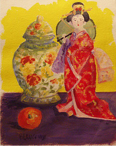
I just joined a group called Illustration Friday , each week they e-mail a theme to you and you do an illustration by Friday, post it to your website and theirs. I'm trying to get a link button here for them but it's just not working at the moment. This week's theme was cats and in keeping with my oriental theme this is called Zen Cat. BTW this group is NOT just for artists but anyone who likes expressing themselves visually, so if you can scribble or doodle this is for you too...lots of fun!

Here's the link: http://www.illustrationfriday.com/

Tuesday, January 24, 2006

Oriental Doll


Today's sketch is done with acrylic paint and continues my recent oriental motif. An interesting set of color combinations is going on here. Opposite or complementary colors are at play. Red/green, yellow/purple create a rather intense visual atmosphere. Thank goodness the green is toned down and light in value! I enjoyed painting this and will probably rearrange some of these objects and do a larger finished paintng at some point.

Monday, January 23, 2006

Playful Primrose


Here is an entirely different interpretation of the red primrose! The whole point of this sketchbook exercise was to really explore the possibilities of watercolor. My goal was to work wet-in-wet for that soft, diffused mysterious look and to see how many colors I could pile on before I got near the point of muddiness. I was hoping to achieve the feeling of ornate richness on the vase, intensity of color in the flowers and a soft harmonious background that functioned as an actual element in the painting not just an after-thought. I did far less planning upfront and just let things flow....and now I'm beginning to see the kind of spontanaity that watercolor is famous for.

Saturday, January 21, 2006

The Wetlands Restoration Project


Today I took my sketchbook outside. I went to a local state park where the DEP is working to restore some of the wetland habitat. It was late in the afternoon, I'd already been to the town beach and done 2 oil paintings (click the link in the sidebar to my plein air blog Art & Life) to see them. So after having already painted for a few hours outdoors it was nice to sit in the car and do this watercolor sketch. I was hoping to see ibis or herons but not today, just a sunset.

More Chinese Vases


Continuing on with an oriental motif, I made use of the Chinese vases and primroses again. One thing I always notice, and dislike in many watercolors I see, is that the colors seem thin and pale. It's as if the artist was timid or perhaps was painting with one of those little watercolor sets you give a child. On the otherhand, a really well done watercolor IMHO makes use of deep, rich, resonant colors. That's what I'm after here in these sketches, learning to get that depth of color without overworking and getting muddy. Watercolor is hard because you ability to "fix" mistakes is limited and there quickly comes a point of no return. It unfortunately happened in this sketch. I wanted to correct the edge of the blue vase at the opening on top and to the right. I went back with paint but it was a bit too dark and when I tried to lift the paint I damaged the paper surface, leaving it rough and ragged *sigh*. No amount of careful scraping with a razor blade would restore a smooth surface. So I let it dry and carefully added a wash of color, but to no avail. Though it doesn't look bad in the photo in reality when you see this piece you notice the damage to the surface of the paper and it detracts from the rest of the piece. And that's the hard thing with watercolor! After working on a painting and bringing it nearly to completion you go back to make a minor correction or change that's supposed to improve the painting and you end up ruining the whole thing! Which my explain why many watercolorists "quit while their ahead", and leave their paintings thin and pale. Continuing to work and develop the piece can be risky, but probably worth the effort, if you can stand the frustration!!

Thursday, January 19, 2006

Primrose in the Corner

Aren't these colors absolutely delicious!!
Pink, purple, green and yellow. If that doesn't say spring I don't know what does. Too bad it's only spring on my windowsill and not outside. It will be a long while until I see these kinds of colors in my garden....I'm already poking around looking for snowdrops and snow crocus! But it's too early. This little painting is 8"x8" and done in acrylic paint on illustration board.

I wanted to call your attention to the link in the side bar for Blogs Illustrated. It's a web-ring that will take you from one illustrated blog to the next. There are many wonderful things to see in the ring so take a few moments out of your day to make the journey, you'll be glad you did!

Wednesday, January 18, 2006

Primroses and Chinese Vases


The winter has been particularly gray this year, day after day without any sunshine. Very depressing! A good remedy for the blah feelings you get from such gray, rainy spells is a trip to the local greenhouse and garden center. Colorful racks of seed packets fuel dreams of this spring and summers' garden. But the greenhouse is the real treat. Filled with warmth and light and table after table of glorious green, growing plants and colorful flowers. I chose two varities of primroses and some elegant chinese vases to put them in. They have brightened up my winowsill considerably and provided interesting subject matter for this watercolor sketch. The Impressionists, as a group, were very influenced by oriental art. In the 1854 after more than 200 years of isolation Japan begins to open trade ports for western ships. By the late 1800's, the time of the Impressionists, Japanese art was flowing into Europe, and the beautiful and elegant stylization and forms of orientl art began to inspire their paintings. I love oriental art, although I confess I don't have much "book knowledge" about it. I just know that whenever I see it, it strikes an aesthetic chord in me. So much to explore and so little time!!

Click here for a "primrose haiku"
http://allpoetry.com/Poem/583483#add


Thy smiles I note, sweet early Flower,
That peeping from thy rustic bower
The festive news to earth dost bring,
A fragrant messenger of Spring.

from To A Primrose - Samuel Taylor Coleridge

Monday, January 16, 2006

Oriental Vase


I wish I could afford a real blue and white porcelain oriental vase! They are just so elegant in their shape and delicate decoration. This is a cheap imitation I bought recently with the intent of using it in floral still life set ups for oil painting. The shapes of these vased is always tricky to get right, especially the symmetry. After about 50-100 sketches I think I'll have a feel for it. These are just the beginning!

Charcoal, white conte and watercolor.

Out of Control Amaryllis


Here's the update on the amaryllis. It's sitting in the front window beautifully backlit by the SUN, which we haven't seen much of this month! I've grown an amaryllis each year, as a winter ritual of sorts, for a least a decade probably longer, and this is the leafiest one I've ever had! The sketch doesn't do justice to this sprawling giant! I'm definitely going to have to put a stake in the pot to hold it up.

Black marker w/watercolor

Saturday, January 14, 2006

Flowers Yet Again


Here is yet another interpretation of the flowers done in oil paint. This has been very interesting! It's reminded me of the similarities and differences of the different media. It also reminded me of the things I like and dislike about each one. Watercolor can be overworked so easily and requires a lot of up front planning but has such a crisp and fresh look to it. Acrylic allows easy corrections and re-working without ever looking overworked and muddy but dries quickly and requires other ways to blend and soften areas. Pastel is soft and smudgy, too smudgy! Your hands get sooo dirty! But the colors are delicious. Oil paints are really my favorite, having good color, the ability to create a hard or soft look and work in layers or wet in wet. But they require turpentine or mineral spirits and messy clean up. Each has its own unique characteristic and look. It's a lot of fun to be able to work in different media now and then.

Flowers Again


Here's that same $5 bouquet done in pastels. This is turning into a very interesting little project, exploring the same subject in many different media.

Friday, January 13, 2006

Flowers Again


Well here's that same bunch of flowers again, this time painted in acrylics. This is just a small 8x10 study and started out as a demonstration for the students in my beginner's class. Every medium has it's strengths, weaknesses and particular "look" as you can see by comparing the watercolor to the acrylic. Which do you like prefer?

Thursday, January 12, 2006

Watercolor Flowers

Watercolor is a difficult medium and one I have never fully mastered. So towards that end I'm doing some work in watercolor hoping to improve my skills. Working directly from your sunbject is always the quickest way to improve. A $5 bouquet from the supermarket in a cobalt blue bottle from the flea-market makes a cheerful subject during the gray days of winter. Watercolor is all about planning. The more work you do up front the bigger the pay off at the end. My pencil sketch for this was more detailed and accurate than I would have done if I were working in oil or acrylic.The shape and placement of the flowers, stems and leaves needed to be correct right up front, as did the bottle. The luxury of waiting and making decisions about what's included and what's not, is not available to the watercolorist. You need to know going in where everything will be. The other big area of planning is leaving white space for your lightest light. In this piece I had to know ahead of time that I wanted to leave that little strip of paper white for the highlight on the bottle. With an oil or acrylic painting I wouldn't be thinking about that until the very end. "Practice makes perfect" is as true for painting as it is for everything else, so expect to see more watercolor sketches from me soon!

Wednesday, January 11, 2006

A Dog's Life


Life is busy, busy, busy for me. But not for a border collie! She has time to laze around chewing a beef ear. It's truly a dog's life.


graphite on paper

Monday, January 09, 2006

Cedar Island Sunset


Capturing the sunset is always a race with the inevitable. Not only is it inevitable that you'll only have about 30 minutes, it's also inevitable that the sunset will keep geting more spectacular as you are working and you can never capture it all! Thus the drive to go back again and again hoping to capture that elusive "perfect" sunset. Pen and watercolor on Lama Li handmade paper.

Wednesday, January 04, 2006

Red Teapot and Marble Rye


More in the "All Things Tea" series. An oil sketch, keeping things loose, no photo-realism here!

9x12, oil on board

Tuesday, January 03, 2006

Red Teapot and Cookie


Another piece in the newly formed "All Things Tea" series. First a light pencil sketch and then watercolor. My skills with watercolor aren't anywhere near what I can do in oils, my main medium. But it's always a good idea to learn new things and challenge yourself. So here's to learning, growing and teatime!

Teapot


Familiar household objects are always fun to sketch. I'm a tea lover and have a collection of teapots and cups and other tea related things and I thought it would be fun to do a series of "all things tea". So here we have the first piece, a china teapot. A bit of an experimental technique using a watersoluable crayon along with traditional watercolor paints.

Staedtler Karan Aquarell-burnt sienna and watercolor.